In recent weeks, I've been making a few seasonal samples for Memory Bound. As such, I've kept my eye on some of the new Valentine's Day lines for color inspiration. This season, I've noticed a couple of lines which incorporate coral (instead of pink) along with teal. Not being a fan of pink anyway, this makes me very happy! As it turns out, I'd been given some paper to work with with just those colors, so the timing was perfect!
My challenge for this project was that the paper I started with (unfortunately I forgot to take a photo of it!) was not specifically for Valentine's Day. I'm totally fine with that, as I'm not really a "themed" person -- I tend to buy products that are not specific to any one season or topic.
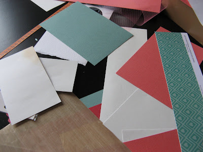
So to make this into a Valentine's Day layout, I first found a Valentine's Day print to go with it, to sort of NUDGE it in that direction! I chose the teal Bo Bunny heart paper shown in this photo below. Here, you can see my messy table as I was pulling together the color palette for this project:
I decided to incorporate the Mini-8 Punch on this layout, as it makes nice little elements to tuck behind photo mats. Here's the right-hand page coming together before I inked it all up. If you're working with disparate elements, inking can be one way of tying them all together.
I cut and embossed several flowers for my layout. You can see how the colors become deeper with a bit of inking. Tim Holtz Distress Ink in Vintage Photo did the trick.
And here's the completed layout. You can see the inspiration paper I started with along the top of the layout. It's fun to start with a paper that is not necessarily themed, then transform and update it with the addition of just a few seasonal elements!


No comments:
Post a Comment