The fun part of any remodeling project is figuring out what you want to do with the space. We relied on the designer at a cabinetry shop to sketch out the space and design a new vanity. She has been a great resource for all kinds of design questions.
We started with the vanity design as the main piece in the room. This vanity is not completely traditional or completely
modern but has some elements of each. The name for that style (I've
learned) is "transitional". The cabinet finish is walnut but the doors are more modern in style (clean lines, no fluting around the edges). The counter is cream-colored (traditional) and is extra deep along the front (modern), a look that I absolutely love.


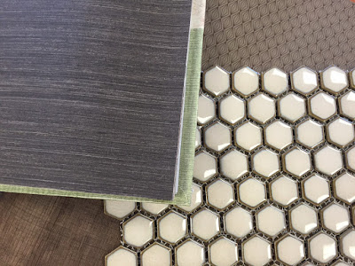
We considered lots of different flooring options and ultimately decided on this 1" hexagon tile in a light caramel color. In person it is absolutely beautiful, and it reminds me of the tile we used to have in the bathroom of our 1923 home. We chose a creamy subway tile for the shower which coordinates nicely with the hexagon tile.
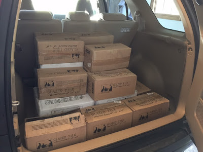
I picked it all up at the tile shop. It is HEAVY! I considered that my workout for the morning!
Next, we turned our attention to fixtures. After a lot of looking, we ended up choosing faucets and shower controls by Delta in "Venetian Bronze". The color is traditional but the style is more modern. Transitional, I should say!
After choosing the plumbing fixtures, we began looking for lighting. Turns out each manufacturer has its own version of "bronze" and, as a result, it was very hard to find light fixtures to match the faucets. Color differences between "bronze" faucets and light fixtures can be substantial.
In addition to color, there were also other lighting considerations, of course. I fell in love with this hanging pendant light and thought it would be great in the space where the tub once was. I was even willing to spray paint the metal to match the faucets. But alas, the fixture components were too long for the space, even when adjusted. We can't be hitting our heads on the hanging light! So back to the store it went. Rats!
When looking for lighting, you also have to consider brightness, which is (obviously) affected by the bulb and by the shade. I really wanted clear wall sconces with Edison bulbs, but they don't put out much light. And brighter light bulbs are just not that attractive when visible through a sconce.
Delta offers some limited lighting options which match their plumbing fixtures, and we finally settled on one of them. It's not what I initially envisioned but at least the metal will match! The shades will probably be too white for our counter and will have to be replaced. The next task will be to find matching pendant lights.
Next, we began to think about what to do with the walls. Spouse tried a couple of options for painting the wallpaper, including applying Kilz before painting multiple coats. Unfortunately, you can still see the seams (and a hint of pattern) through the paint.
We both really liked the bead board in the bathroom of our old house, so I began combing Pinterest for similar looks. After considering a few options, we decided on five foot high wainscoting painted in a cream color to match our wood trim (similar to the photo below). It will cover up a good portion of the wallpaper, leaving three feet at the top exposed.
I proposed covering the area above the wainscoting with wallpaper. Spouse is a very good wallpaper hanger, and he agreed that it was the best solution. My first idea was some sort of grass cloth (for visual texture) but Spouse isn't too keen on the look and it's very expensive.
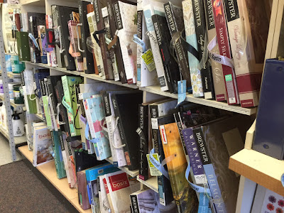
So I headed to Sherwin Williams to check out their wallpaper books. I was on the hunt for something with a low contrast pattern or design.
So I headed to Sherwin Williams to check out their wallpaper books. I was on the hunt for something with a low contrast pattern or design.
When I arrived, my inner librarian had a very hard time with the complete disorder of the wallpaper books! I had to spend a bit of time re-grouping them according to their labels. It was hard to find anything and remember what I'd looked at with this mess...YIKES! :)
Modern wallpaper designs are amazing! I saw so many great designs which would make a perfect accent wall -- just not in this bathroom! The hexagon floor will provide plenty of pattern -- we don't need to add any more on the walls!
Ultimately I brought home a few books with chocolate brown, low-contrast designs. The wallpaper will be the last part of the process so there is no rush. I'd like to see the cabinet in the space before making a decision.
Thanks for following along with me on this project. I'm excited to see the new space come together!
jp


No comments:
Post a Comment