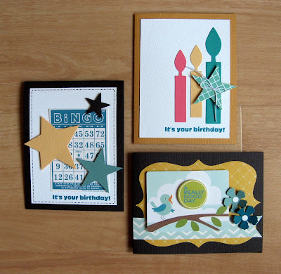
I'm fairly confident I'll never be a true digital scrapbooker, but I am firmly entrenched in hybrid scrapbooking -- at least hybrid as I define it! Hybrid scrapbooking simply involves using the computer to create parts of your project. If you use the computer to generate your journaling, you're a hybrid scrapbooker!
I do that on nearly every layout...and sometimes I do a little bit more. In today's post, I'll show you how I used Microsoft Word and my wide-format printer to make a quick and easy hybrid layout. Actually, you can do this with ANY printer, so if
you have a standard printer READ ON!
But first, a note about my printer. Oh, how I love my wide-format printer! I have an older model Canon i9900 which is no longer made, so I'm keeping my fingers crossed that it'll serve me for a long time to come. Epson makes a wide-format printer which several of my friends own. If you're looking for a great addition to your crafting, I'd definitely suggest buying one. Hands down, my printer is my favorite crafting tool.
One of the reasons I purchased this printer was so that I could print directly on my pages. Do I always choose to do this? No, not at all. It does take some time to set up, but I always love the results.
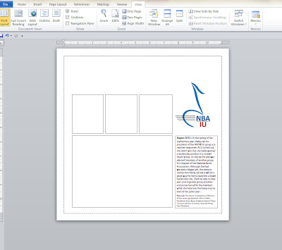
For this particular layout, I wanted a white cardstock base with a dotted border around the outside, much like pen stitching. First I created a basic Word document and used the Custom Size tool to set it to 12x12. So on my screen there was a digital equivalent of 12x12 paper.
Next, I created an 11x11 text box in Word and changed the border to dots. This is easy to do with any size paper and any type of printer. You just need to test to see how close to the edges of the page you can print. Click on the photo below for a closer look.
Next, I created blank text boxes to represent the photos and cardstock pieces I wanted to add to my page. I planned to use a 5x7 photo so I created that box first. Next I created 3 boxes for cardstock pieces and aligned them with the photo box. By setting the text wrapping on each text box to "square", I could easily move the pieces around on the 12x12 "page" until I liked the arrangement. (I often play with text boxes to decide how to arrange things on a layout. It's a great tool for those of us who need a visual map!) Take a look at those 4 boxes below.
You'll also see that I included a logo on the page. I copied this from the internet and set the text wrapping to square so that it functioned like the text box, enabling me to re-size it and move it around on the page.
Finally, I created a text box for my journaling. Once all six pieces were in place, I printed the page on a test sheet. I use the back sides of older patterned paper for this purpose.

Once I was ready to print on my final page, I removed the border from the journaling box. I also removed the borders from the four blank text boxes. It's better to simply change the border to "no line" than to delete the text boxes -- text boxes can sometimes move when you don't want them to, so keeping them in place with no lines ensures that everything will stay put. Of course, you could print the page with the lines as guides for placing your photos and cardstock. I sometimes do that!
After printing out the page, I simply adhered my 5x7 photo and my 3 blocks of cardstock. This hybrid layout was done in almost no time at all!


