This is a test. I repeat, this is only a test.
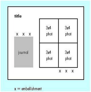
I've been creating my own sketches lately based on print advertisements and text layouts from magazines. This one is based on an article layout in Martha Stewart Living magazine. The article itself has a block of 4 photos at the right and the text at the left.
I've been drawing my sketches on graph paper, which is much easier than blank paper, since I can use 1 square to equal 1 inch on a 12x12 sheet. Once the sketches are done, the next step is to get them on the computer so they can be used for classes and posted on my blog. DD suggested creating them in Excel. Since I'm pretty much a linear person, Excel actually worked great and is what you see here, saved in JPEG format. (For some reason, the "o" in "photo" cut off when I posted this. Not sure why that happened.)
Last week I blogged about my cardstock pieces cut in various sizes. As I create the sketches, I've been using the cardstock pieces to "test" and refine them. I'm finding that these two tools go hand in hand for me.
I have been teaching a series of graphic design classes at the LSS over the past couple of years. I've added to that series and now have four classes covering various aspects of design principles. Since we often discuss print advertisements as inspiration, I hope to add a "create your own sketches" class for 1st quarter next year. I've used sketches from various sources in the past, but I am finding that I really like creating my own, since I can develop them to meet my own needs.
Looking forward to everyone's thoughts! Remember, this is only a test! If you use the sketch to make a layout, I'd love to see it. Tell me how it works for you.
Great sketch, Janet. I have two LOs done using it. I'll try to take a pic of them and send to you. Hope the sketches are a regular on your blog.
ReplyDeleteGood idea. I tear out advertisments I like and keep them in a binder. I should draw a sketch to go with them. Then maybe I'd use them!
ReplyDelete